Floral Delivery App
Project Idea
This is a showcase of my latest prototype for a floral delivery app. After about a month and a half of hard work, I can safely say that I’m satisfied with my final product. In order to complete my high fidelity prototype, I produced many artifacts along the way. These artifacts not only make the design process smoother, but they offer a chance to be innovative and collect new ideas as well.
Something different about this project, in particular, is that I used Asana as a project management tool. It was helpful to keep myself on track by setting my own deadlines. I was also able to allocate how much time each task was going to take which was a great way to manage my time wisely.
To begin any project I like to find design inspiration and research. I used a lot of articles referring to successful UI/UX designs. One of the main reasons why I gather this type of research is to stay on top of design trends. Instagrammers like Michael Filipiuk and Alesya Zavadskaya are some of the many UI designers I follow on Instagram. I enjoy designers that offer helpful tips for aspiring UI designers.
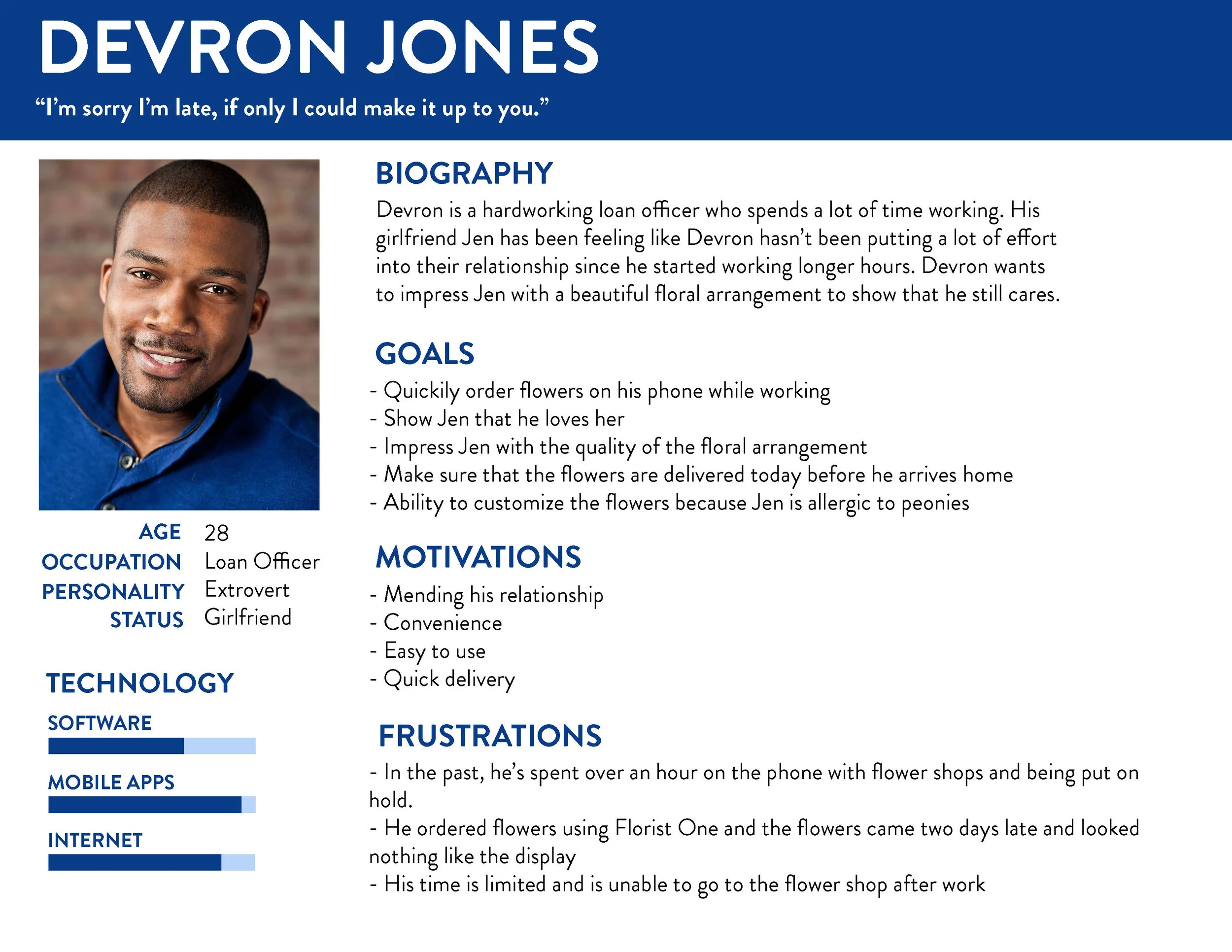
Persona
This is a persona named Devron. He is the perfect example of my target market for my app. He’s an overworked loan officer whose relationship has gone sour. He doesn’t have the time to call flower shops or go to the store. He needs a quick and easy route to smoothly place a floral delivery order to his girlfriend.
I’d like to market my app to the younger generation because I believe that if ordering flowers was easier, more young people would do it more often.
Empathy Mapping
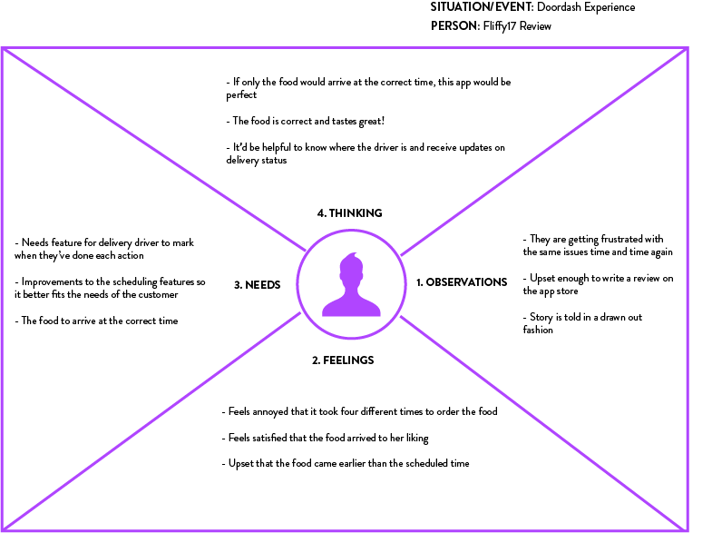
My empathy map was based on the negative reviews from current delivery service apps. It focused deeply on the user’s feelings and needs.
I made this template to really show the essential components needed for my app. The communication with the delivery driver feature was very important for user’s based on my survey. I also assed that my app would need to provide updates on the time the arrangement would be delivered.
Information Architecture
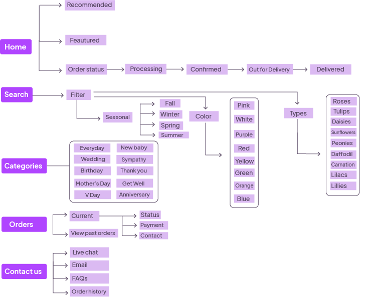
My information architecture was used as a guide when I was creating my wireframes. I like to build my wireframes directly from XD, therefore having this open alongside it is very useful.
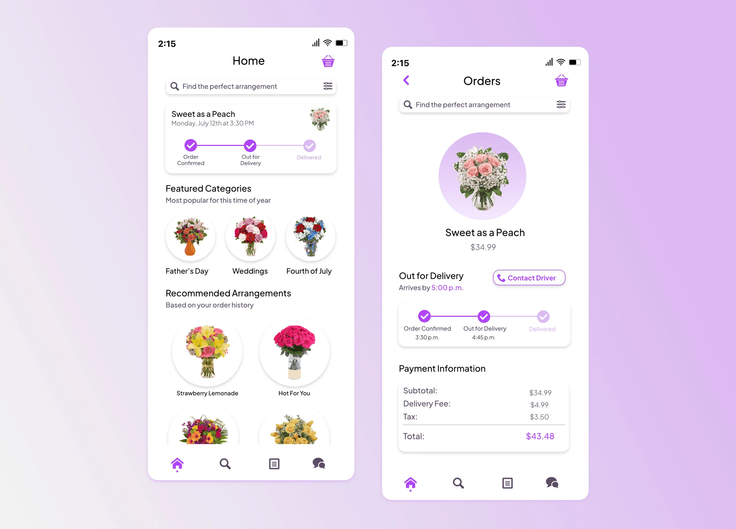
Wireframes
Here’s a sample of my wireframes. I gathered inspiration from a lot of different designers. One of the top design trends right now is white boxes with shadows. I created these throughout my wireframes because I knew I’d implement them in my final comps.
The typeface I choose is Plus Jakarta Sans, which I downloaded specifically for this app. I like its clean layout and readability. Because my user research demanded the app needed to be easy to use, I knew this font was perfect.
Prototype Video Walkthrough
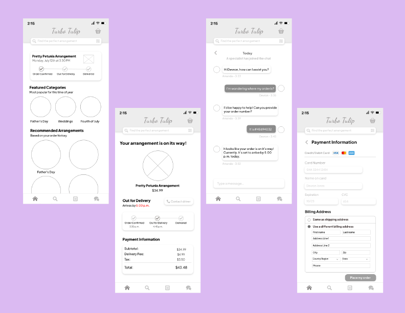
Designers should always set some extra time for themselves when designing comps because there is a good chance you’ll need to add more screens along the way. While I didn’t create every screen for my app, I made an adequate amount of them to understand the basic functionality.
After designing the screens, I finished linking them all through the prototype feature in XD. I was able to complete them in two days which was impressive considering this has taken me much longer in the past. I think using Asana as a project management tool was also very beneficial when it came to productivity and overall success.